

“This moment is the only thing in which I am at all interested. Ergo, who cares for anything I do? And what do I care.” --William Carlos Williams, “Spring and All”
The other day, I visited a friend of mine. We did what friends so often do. Sat down, had coffee, had a little chat. Played with the dog. Went out to the studio and spent five hours working on a letterpress project.
Julie is the proud owner of a Vandercook letterpress that once belonged to the art department at the University of Northern Iowa. For the better part of a decade she has used this giant instrument to compose a wealth of material: broadsides, greeting cards, fine art designs, bookmarks, and books of poetry, among other things. Her work makes use of ornamental antique type, and fuses it with her own etchings, carvings, and writings. Depending on her mood, the marketplace, available materials, etc., this might produce an elegantly simple card or a complex geometric composition that takes a dozen or more runs of the press.
On the day I worked with her, our project was a bookmark. Sounds simple enough (and the final result looks simple enough), but the work put in from concept to design to finished project was remarkable.
We began with a simple drawing of Julie's. Cobwebs in honor of Halloween. She had traced her pencil lines with glue, causing them to jut out to become print-capable surfaces. Secondly, Julie had selected a vintage piece of illustration to add to the top of the mark, a silhouette of a Victorian woman reading by candlelight. This was something that might have appeared in an advertisement in the corner of a magazine or newspaper from another time. For our purposes, it served as a mood-setter. It took us out of our own world and put us in the mood to read something transportive.
Finally, we set a little type. Julie had drafted a bit of verse, but suggested that I might revise it. It was a friendly gesture, inviting me to be a part of the process, and complimenting me by suggesting she had faith in my poetic craft. After three or four tries I drafted something that I felt fit the spirit of the process, and she seemed to like it.
Then to type. This took me a fair amount of time to complete. In hopes, I think, of giving me an appreciation for the work involved in setting type, Julie allowed me to set the lines myself. It took effort, concentration, tweezers. At one point, I realized we were short by a single letter—her type kit had only a limited number of a certain character. So I revised on the fly, changed a conjunction to make use of what type I had, and learned a small lesson about gratitude, resourcefulness, and necessity.
Employing those skills of paraphrase, engaging the semantic strengths I've developed over decades of reading and writing, and sapping up the sentiments inspired by the Hallowtide holidays, has caused me to spend a bit of time reflecting on this experience, the drying leaves of which I'm sharing with you now.
Julie and I spent quite a while setting the paper, attending to the ink (cleaning rollers, changing colors, adding more to achieve the desired saturation). It was a long process for very small return. After errors were accounted for, and satisfactorily straightly-lined prints trimmed to size, we had only eight or ten bookmarks.
Three lines of poetry, totaling 30 characters, written that morning, came out in an edition of eight.
This seems symbolical to me, somehow. Considering it, I think back to my career over the past ten years. In 2007, I released a single volume on Julie's Caveworks press. I've published nothing since.
In the past two years, I've only typed up ten or twelve poems. These typed versions were not sent out to publishers, but were printed large scale for gallery exhibitions of my work. Nine of the poems were printed out as a chapbook—in an edition of two. It was a Valentine's Day gift for someone. I'll let your imagination shade in the rest.
With the exception of my volume on Caveworks, I have published only three poems: one here in the North American Review and two in Inner Weather, the student publication at the University of Northern Iowa.
Aside from that, all of my publications have been collaborations with Friedrich Kerksieck, another Iowan letterpress printer located now in New Orleans (https://www.etsy.com/shop/smallfirespress).
Yet I continue to write, am writing seemingly all the time, in head or by hand. I've a trunk full of hand-filled notebooks. I've scraps of paper everywhere.
And I've published others. Chapbooks, journals. I'm editing a chapbook series right now called Quick and Dirty Press. Its second title is coming out next week. I'm Founding Editor of the cant journal based out of Kansas City, which continues to emerge despite my retirement from its offices.
In short, I'm busy. Too busy to publish, perhaps, but that's not what it's about. It's a philosophical distinction on my part, a conceptual framework forging my attitude to fit a certain form.
I write first for pleasure, second for philosophy, and third for literary accomplishment. Somewhere in that mix is publishing, sharing, commingling.
It's not that I don't share at all. I read—at open mics and featured performances. Or, I recite, I incant, I chant, I intone.
And I leave little litterings behind, detritus, ephemera. Perhaps some of it will stick, and last. Perhaps I've poems yet to be discovered, waiting in the shadows of undecoded notebooks, longing to be set to type.
Aaron McNally lives in Cedar Falls, Iowa where he runs the Q&DP chapbook series. He is the author of Out of the Blue(Caveworks, 2007), and has published several poems and two chapbooks co-authored with Friedrich Kerksieck. His reviews have appeared in Rain Taxi and The Cream City Review. He is the founding editor of cant, a poetry journal.

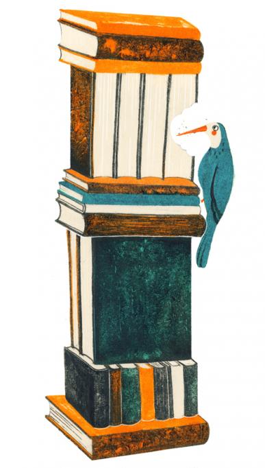
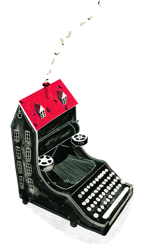
Illustrations by Raquel Aparicio: I feel grateful this is going to be my ninth year dedicated to what I love, drawing. I live in Valencia, a sunny city in the coast of Spain. I taught a collage illustration workshop at the Circulo de Bellas Artes in Madrid; I also taught in diverse countries like Serbia or Paraguay. I work in a variety of media exploring different styles, producing illustrations, animations and comics. Mostly I work for magazines and illustrate children’s books, but I’v been also designing graphics for garments, advertising, and newspapers.
My illustrations were published in The New York Times, The New York Times Magazine, Boston Globe, New York Observer, The Scientist, Nylon, Dazed and Confused (Corea), Runner’s World, Prevention, Rolling Stone (Spain), Mia, Elle, Quo, Angel’s on Earth, Ragazza, Stella (UK), Psychologies, LDS Living, Ling, Yo Dona, Calle 20, H, Chow, Lados, Viajar, Looc, Europa, Forma (Paraguay), Simon & Schuster (US). Raquel is represented by Purple Rain Illustrations, Ella Lupo, T: 609-497-7330 C: 732-690-2515 ella@purplerainillustrators.com