

 In creating a broadside, I approach it much like any other creative endeavor: a stack of blank copy paper and .05 roller ball pens. I begin with a preliminary read of the author’s work and produce sketches enveloped by the initial gut feeling. The second step invites rational and reason to join the process, both of which I believe are not the friends of any artists (they spend too much time with academics as well as penny-pinchers). With my two guests in tow, I reread the work and they question the initial sketches. Much scribbling, cursing, and wadding of paper follows this second step. In all honesty, depending upon the piece, step two becomes replicated into step three, four, five, and so on until the print begins to surface among multiple layers on a Photoshop/Illustrator screen.
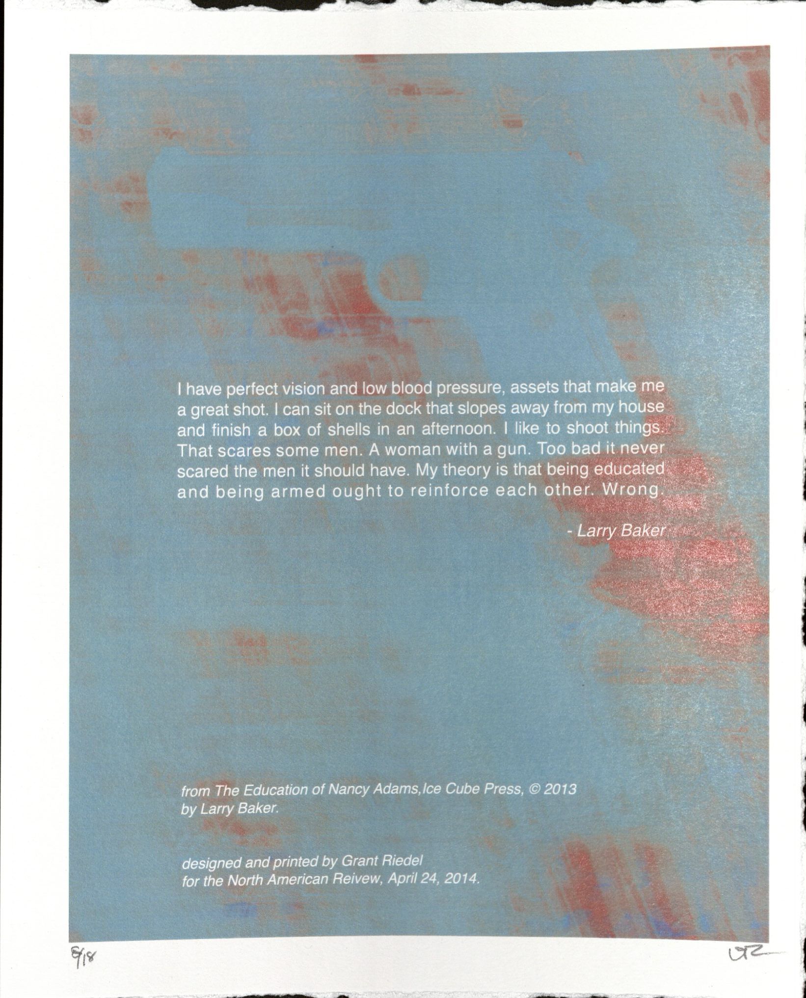
The Photoshop/Illustrator stage is where I make the color decisions (if I haven’t already). Occasionally, I add additional sketches with a graphics tablet and … this just got boring, really. To return to the color decisions or the idea thereof, I make them well before this stage, and like the initial sketches, the color is usually based on that gut feeling. Question: Does that feeling ever change when creating the digital proof? Answer: Yes. For example, the broadside created for Larry Baker became a digital broadside based on how the colors turned out digital versus silkscreened. So what about silkscreen printing?
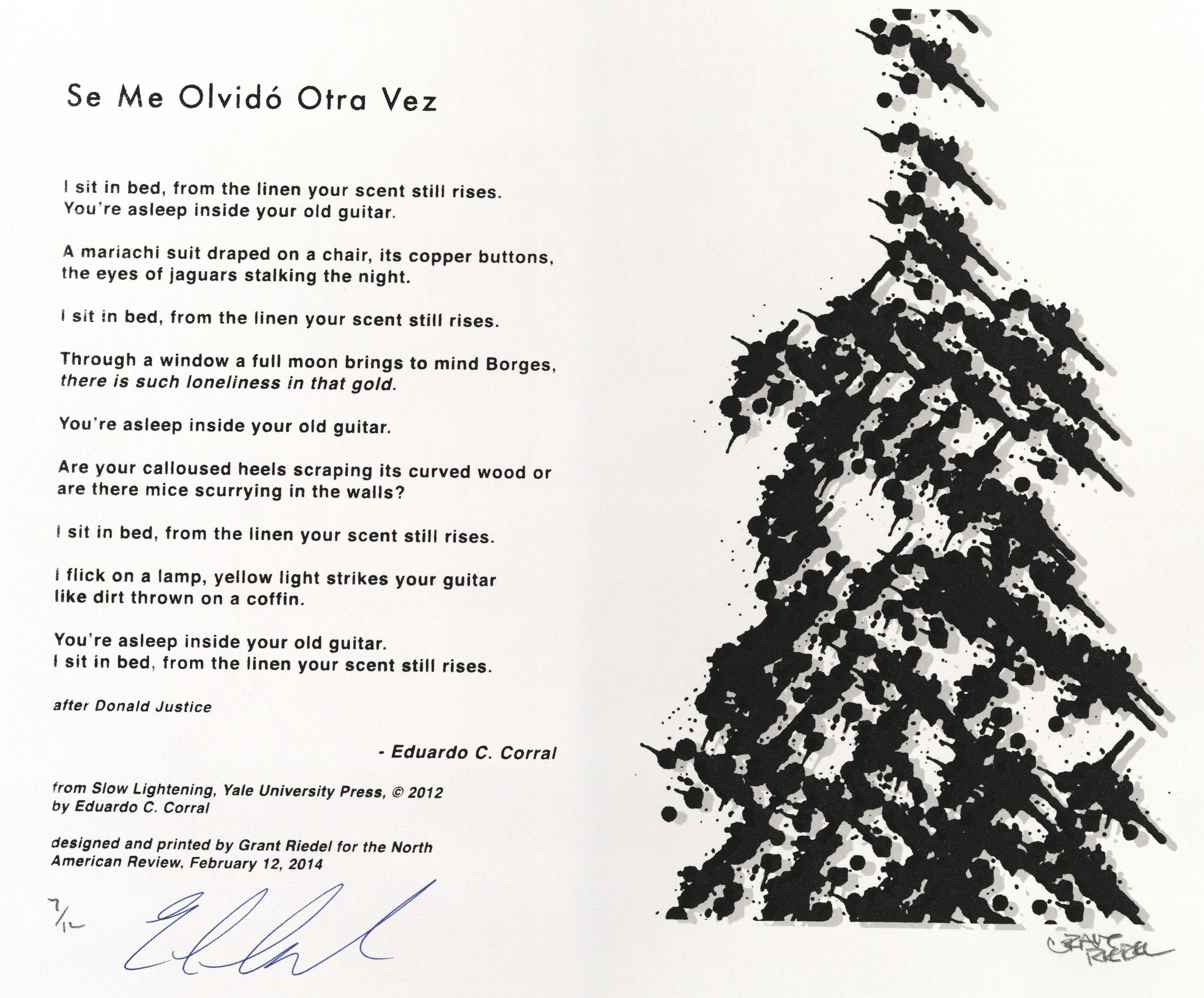
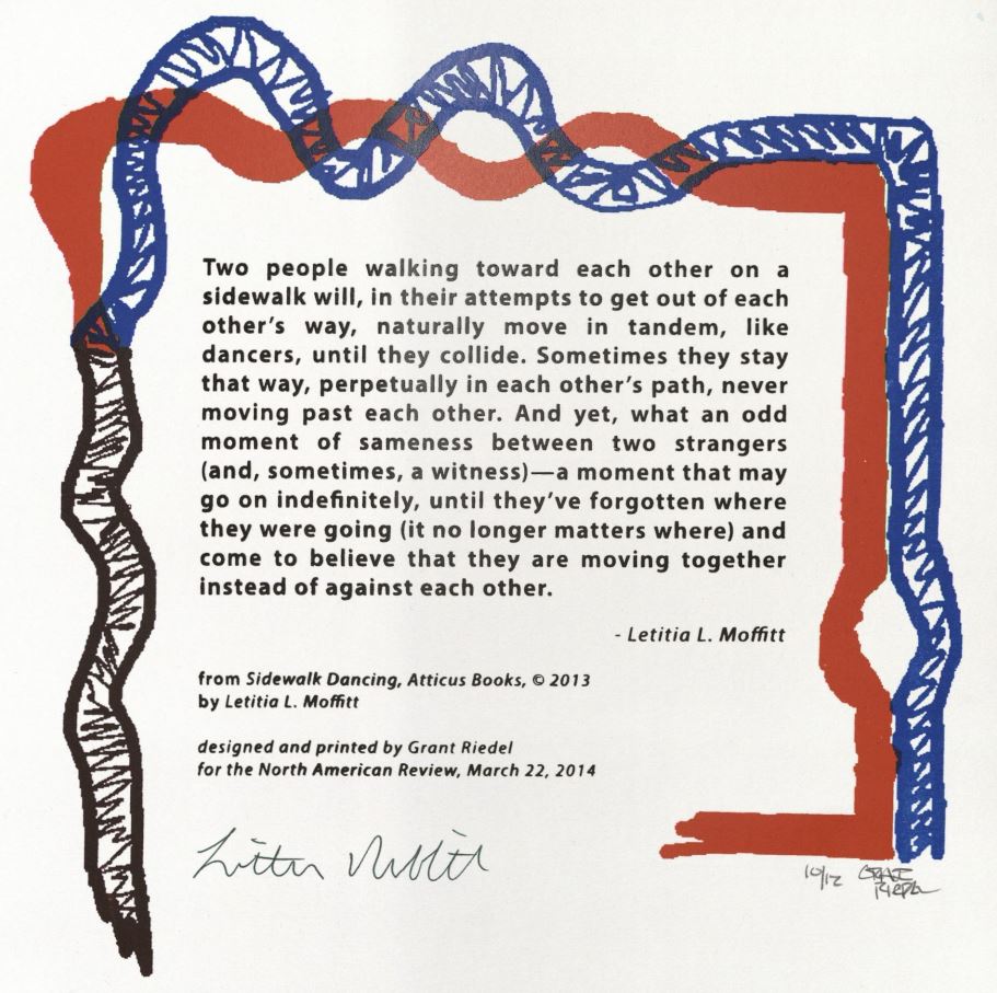
 The prints I have created, minus the aforementioned Larry Baker’s, have all been silk screened. The medium was chosen based on my personal affinity for it. Much of my undergraduate career at UNI was spent with the printmaking department. The process is relatively simple: create a black and white stencil, expose the stencil to an emulsion coated screen, and push ink through the stencil now created on the screen. There is beauty in simplicity, enough said. Most of the prints were printed with plastisol ink. It is ink that has to be heat cured. The choice was made because this ink gives the print a little bit of texture, lending the “handmade” feel.
In essence, 99 percent of the choices for the print go back to beginning, to the gut. Even the paper I chose fell within the 99 percent. I’ve skipped over the minor details (combining this ink with that, choosing to rip the paper so it has a deckled edge, sleep deprivation). Creating a broadside is an inspired process. Question: Do you have any idea if you have interpreted the author’s work to their intentions? Answer: No, that’s the beauty of art. There’s no right answer.
Grant Riedel is an artist who hails from the Midwestern town of Blakesburg, Iowa. He holds both a B.A. in Art and a M.A. in Creative Writing from the University of Northern Iowa. When Grant isn’t creating new broadsides for the North American Review, he spends his time with his wife and daughter, Raegan. In terms of writing style, Grant recognizes the influence of authors such as Margaret Atwood, Raymond Carver, and J.D. Salinger. Recently, he was published in the summer issue of Black Fox Literary Magazine. As for visual artists, Grant’s printmaking work has been impacted by the work of artist Ryan McGinness. Over the next year Grant has plans to bury himself in PhD applications, hoping to find the right school to call home. You can purchase the broadsides which are signed by the artists on our online store.