Flashback Friday Featuring Amanda Chan, Illustration from Issue 292.2
As a soon-to-be graduate from the University of Northern Iowa's Bachelor of Fine Arts program in early 2007, I was only too delighted to receive an illustration request for the North American Review. Having studied under the art direction of Roy Behrens, I looked forward to contributing to the publication.
After reading and re-reading Steve Fayer's short story multiple times to grasp its content, I set pen to paper to sketch 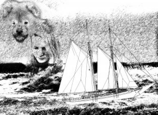 out composition ideas. My hand can more quickly scribble out layouts of varying proportions before converting to monitor and mouse. I judged the most crucial elements to revolve around the schooner, woman, and dog; as much as I could continue to make chicken scratches on paper with these three, none of the effort would matter if I could not reproduce these components digitally.
Some digital artists may use fancy Wacom products to create their illustrations, but as a Poor College Student and regular torrenter of Photoshop, tablets with styluses remained filed under "Luxuries I Cannot Afford." My instincts took me to browsing the depths of the Library of Congress’s online catalogue and sxc.hu The latter renamed itself to Free Images in recent years, so current university students cannot lie to themselves that they're surveying a paid stock photography site. Enter search query. Scroll. Click. Save. Repeat.
In choosing an aesthetic, to this day I continue to be fond of the contrast between linear drawings against photographs. Organic forms paired with geometric ones. Solid flat color fields against chaotic textures. Dualities continue to captivate me, and my visual aid for Sea Dogs is one early example of my experimentation with this notion.
After collecting an assortment of image assets, I set to work: cutting ships away from busy backgrounds, converting the woman from full-color to grayscale, and adjusting, literally, the hair of the dog. Layer one element over the other. Try another opacity mode. Move that layer. Shrink it. Scale it. Undo. Redo. Question all of my past life choices that led me to this indecision.
Because of my shyness and inexperience and impending finals, I chose not to get a second opinion as I worked on this project. Designers need to be confident, right? Designers need to learn how to stand by their work, right? Designers can work in isolation, right? But I mostly used these veiled excuses to avoid any potentially unnecessary correspondence, be it in person or over email. In time, I would learn it is completely acceptable to get second or third or sixth opinions. Perhaps they are followed, perhaps they are ignored. But in 2007, I took a chance on listening only to my own opinion. I have lived with the final result, and the world has continued to turn.
This illustration focuses on the linear drawing of the schooner in the foreground; its solid white sails are meant to weight its physical presence over the fainter, more ethereal faces in the sky. Their countenance remain hardened by a life at sea, yet remain floating amongst the tangled memories of our central character.
Amanda Chan is a mobile and user interface designer for MakerBot, helping people print things in 3D. Previously she worked as an in-house designer for The Huffington Post. She received her BFA in design from the University of Northern Iowa, taught English in Shenzhen, China, and played in one cover band before finding a tiny apartment in New York City.
Follow her on Instagram https://instagram.com/amchan03, and Twitter https://twitter.com/amchan
Recommended

Nor’easter
Post-Op Appointment With My Father

Cedar Valley Youth Poet Laureate | Fall 2024 Workshop