A Behind the Scenes Look at Art Selection and Cover Design for the NAR
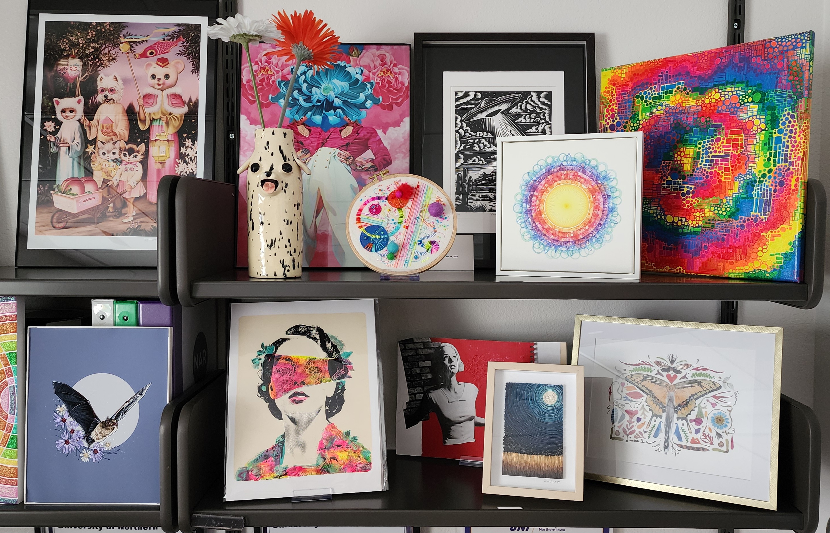
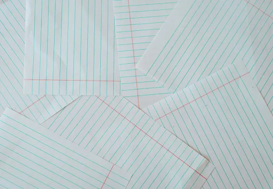
When the North American Review rebranded in 2019, the magazine’s new format grew larger at 9 x 12 inches and 120 pages, became a perfect bound book format, and moved to full-color interior pages. This was the turning point when visual art became an elevated genre for our publication, now on equal footing to the genres of writing we publish. Although there were many illustrations in issues prior to the rebrand, the magazine was both limited in space and color, so they were often small, and we could only print in black and white, so they were typically line art. I love bright colors, and since I joined the staff in 2020, I try to get the most out of that full color printing!
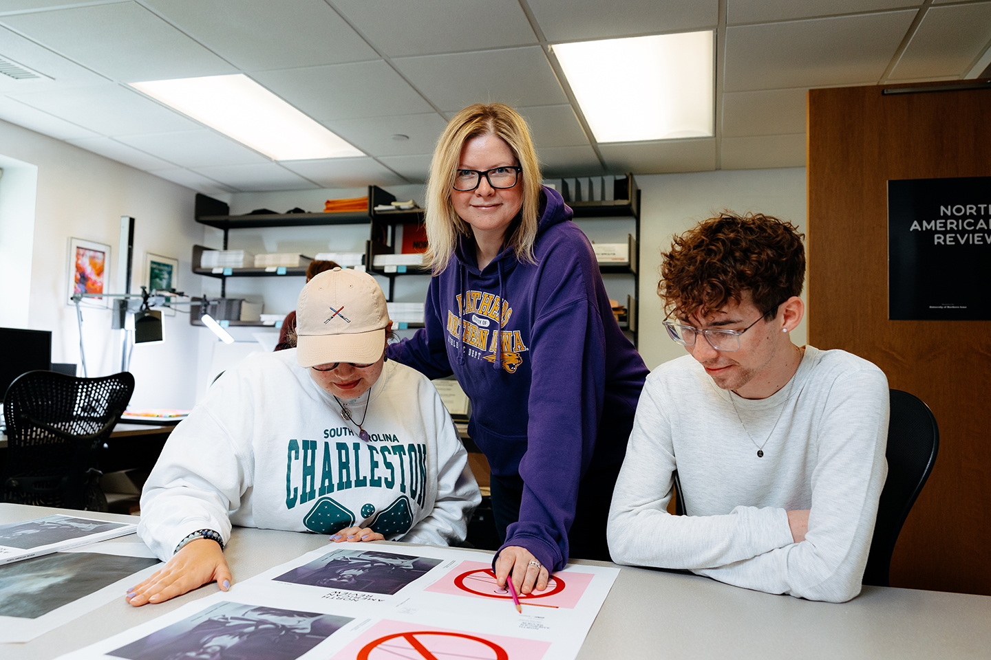
Some readers may not know this, but the North American Review is housed at the University of Northern Iowa, and we are the only public university in the state that offers the opportunity for undergraduate students to get hands-on experience at a prestigious literary magazine. (These are the editorial assistants listed in our masthead.) Each semester, two of the NAR editors co-teach a creative writing practicum course in which students learn how to read submissions, copyedit, fact-check, and communicate professionally with authors, in addition to doing website updates and layout in Adobe InDesign. As both the Managing Editor and the Visual Art Editor, I visit class each semester to give a guest lecture in which I explain what exactly I do in my job as someone who holds both of those titles. I thought the section about my process of selecting visual art for an issue, and the process of working with Gary Kelley for the cover art may also be of interest to readers and artists who submit their work for consideration to give you a look behind the scenes.
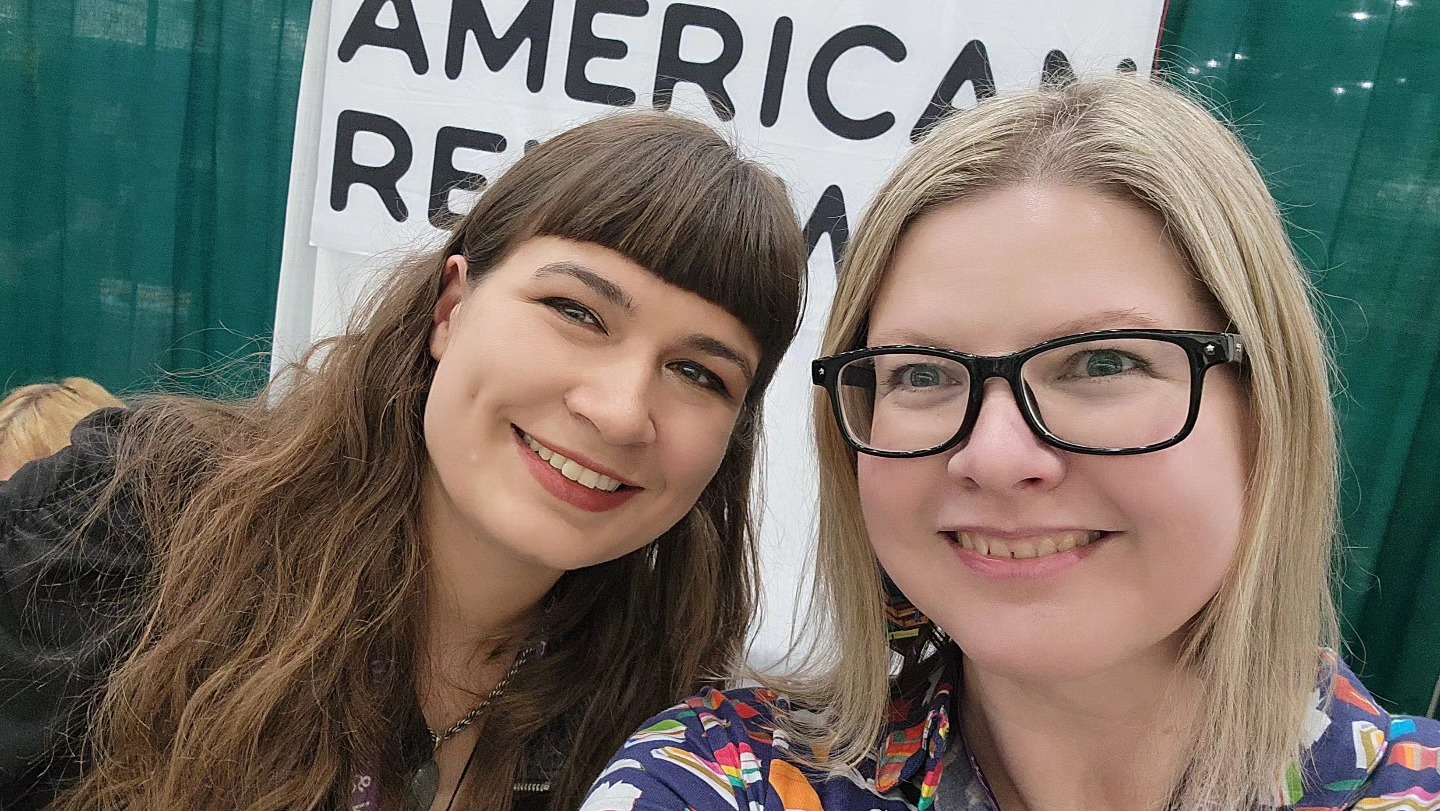
The NAR generally pairs one full page piece of visual art opposite the title page of each piece of prose. Poems are often short enough to print several on a single page, so the only time we use artwork with poetry is when the poem is either long enough to span several pages, like “Footprints: Eight Tracks” by Richard Jackson in the Fall 2024 issue, or when there is a special section of poetry, like the folio of poems by New Zealand poets in our most recent Summer 2025 issue. Chris Tse, who curated and wrote the introduction to the New Zealand poetry folio, introduced me to the amazing artwork of fellow New Zealander Rebecca Hawkes. To set the section of poetry apart from the rest of the issue, we bookended it with two pieces of Rebecca’s art. She is a writer as well, and I was fortunate to meet her in person at the AWP 2025 conference. Because we publish people from across the world, it’s rare to meet our authors in person, but even more so with the visual artists who typically don’t attend AWP!
Visual Art is one of the few forms we offer as fee-free on Submittable. It is also the only genre that we can pay to publish. Unfortunately, we don’t currently have the budget to pay writers for publication, but it is our goal to do so in the future. Offering free submissions to visual artists can sometimes mean that we are inundated with pieces that are not at the level we are looking for. However, in the spirit of being open and eclectic, we do want to see work from artists that are not necessarily established or professionals.
Because I am also the Managing Editor and the only full-time member of the staff, I am extremely busy juggling many details of the business of running a magazine. This means that there are often very long response times for visual art submissions. When I pair art with stories and essays, I look for work that complements the writing, but is not necessarily an illustration. I’d like the artwork to stand on its own as interesting, and there are always reasons why I paired the pieces together, even if it is not immediately obvious to the reader. Sometimes the themes of a story are very complex and difficult to match art with, and in those cases, I really appreciate having abstract pieces to use. I encourage more abstract artists to submit your work for consideration. Another reason for the delay in submission response time is because the collection of writing I’m looking to find art for is always changing, so although the submission may not work for any pieces in this issue, I don’t decline submissions for a long time in case I may be able to use it in the future. I check back to the Submittable list with each new issue, which happens three times a year, generally in April, July, and October. Artists can withdraw at any time, so simultaneous submissions are encouraged.
My process for finding art starts with first reading all of the pieces of prose selected for an issue. I consult our flat plan, which is a map of how the issue will be laid out. Then I create a spreadsheet in which I list each piece of prose in the order they will appear in the pages, and link to the manuscripts organized in our Google Drive. One by one, I read each piece, and I make notes on my list about the plot points and if anything stands out to me as being visual imagery that could influence what kind of art I’d look for. The other editors select different genres of written work, with Grant Tracey and Adrianne Finlay accepting Fiction, and Jeremy Schraffenberger selecting Nonfiction. They are not aware of the content of each other’s selections, so when I read these pieces back-to-back, I am the first person to get the feel for the issue as a whole.
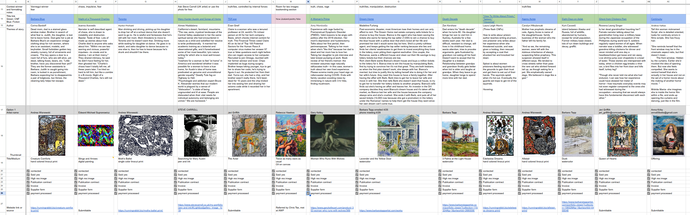
Once I know what I am looking for, I first look at Submittable. I follow many artists on social media, so the algorithm is always suggesting new people for me to see. I take a lot of screen shots on my phone of things that I want to remember to return to. We also keep a list of artists that the editors come across that we like, so I often consult that as well. Although we can pay artists to publish their work, the stipend is small. Rather than commissioning new work to be created for us like we do with the cover, the images inside the magazine already exist on artists’ websites, and I am just asking them to provide high-res image files. We generally pay $100 per image and have to stay under $500 per person, so I try to find multiple pieces per artist. This is for two reasons: If I can offer someone multiple hundreds of dollars to publish several of their pieces, they are more likely to say yes to my inquiry and it makes completing the payment paperwork worth their time. The other reason is that having the same style of art appear throughout lends visual continuity to the issue. Once an artist is a supplier in our university’s payment system, it is easier to pay them again in the future. Sometimes I recall an artist from a previous issue whose work would work perfectly with a piece of writing, so I will reach out to ask them to use a single piece in a different issue.

We don't usually do themed issues. However, after I make my notes about each piece of prose, I find it very interesting that, purely by coincidence, there are always several themes that appear multiple times across each issue. For example, in the Summer 2025 issue, several pieces featured female main characters; the concept of truth versus lies; chaos, rage, and destruction; and the idea of being controlled by something else inside of you. I create a list of these themes and I explain the plots of the stories they came from, with relevant quotes to illustrate the ideas. This is what I take when I meet with Gary Kelley, our Cover Art Editor who is the artist that creates the cover images.
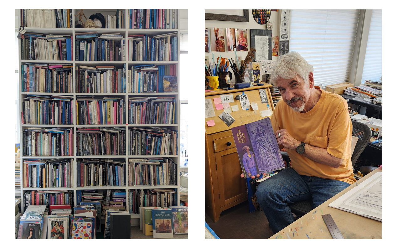
If you are not familiar with Gary Kelley, he is a prolific, internationally-known artist with long ties to the NAR. His first cover was in 1986, so next year marks his 40th anniversary of working with the magazine, and his style has given the North American Review a distinct visual identity. My audience for this explanation is usually undergraduate students, so I always tell them, if you think you’ve never seen Gary’s work, I promise you have, because he is the artist behind the mural of famous authors that appears at every Barnes & Noble store. Then they all know exactly who I’m talking about.
He has published many illustrations for other magazines such as Rolling Stone, Time, and Playboy, and has worked with clients like the NFL, the NBA, and Google. He has illustrated countless books, published many of his own graphic novels, and won dozens of medals from the national Society of Illustrators. We are lucky to have him living right here in Cedar Falls, Iowa. I grew up in neighboring Waterloo, Iowa, so as a kid who wanted to be an artist, Gary has been someone I looked up to my whole life. When I was a senior in high school in 1999, Gary was asked to judge an art scholarship contest, and he chose me to win it! This led to me coming to the University of Northern Iowa to major in studio art. Back then, knowing that someone I respected immensely saw potential in me really validated my dream of being an artist, and getting to work with him today as a professional colleague means the world to me. I love full-circle moments in life, and it feels like my destiny to be in this position. I do not take for granted how rare it can be to land a dream job in the arts with a Bachelor’s degree in studio art!

As an artist myself, I know how difficult it is to be inspired when you can do absolutely anything you want. Working within parameters makes it much easier to think of ideas. For each issue, I meet with Gary at his studio and we go through the list of common issue themes I identified. We have five different cover templates that we rotate through, so I let him know which three he can choose from for the next cover, to help him determine the dimensions of the original art. It is important to give an artist options and let him decide which theme most speaks to him, then which template his idea for art will best fit within.
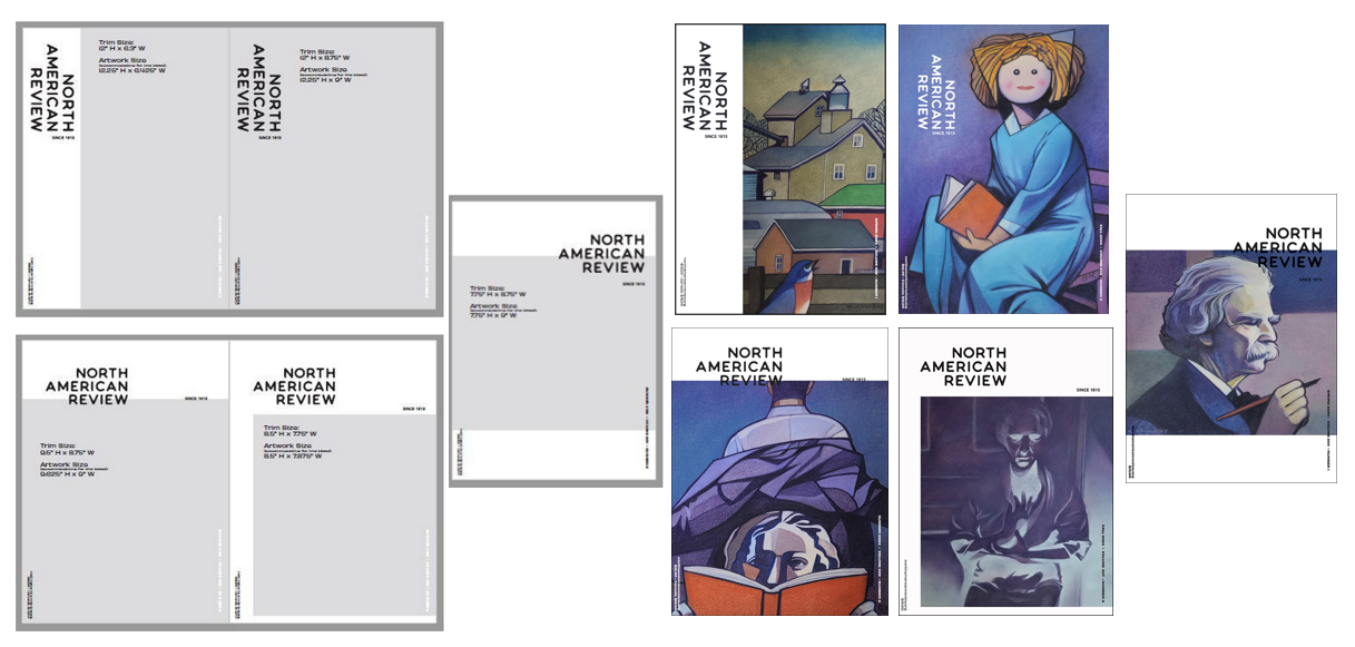
I let Gary know the deadline I need the art by, and he calls me when it is ready to be picked up. Once I have the original piece back at the NAR offices, I use our camera stand with LED lights to photograph the art. Believe it or not, I always photograph the cover art with my phone, but that’s how good our cameras are now. Gary uses matte chalk pastels for his cover art pieces, which makes them easy to photograph without glare. The high-res photo is then ready to be dropped into the correct cover art template in our Adobe InDesign layout. The final part of the process is returning the art to Gary and processing his payment.

In the case of the Summer 2025 issue, the theme that most inspired Gary was the idea of female rage and violence. Gary is old school, and doesn’t like to use the internet to find ideas. In his amazing studio, he has a huge library of art books and he often looks to them or to his own photography to find images to use as reference for his sketches. He found a photograph he took of his wife Linda when they were on vacation in Europe years ago, and he loved that the sculptural piece she is standing next to has a lot of its face broken off, because it implied violence without being too on the nose, if you will. We agreed that the relationship between the woman and the art also made it interesting because it draws the viewer’s eye to look at what she is seeing. One of my favorite parts of the cover art process is seeing Gary’s sketch, then comparing it to the finished product. I am very lucky that he lets me keep the original sketch or a copy of it for the NAR archives. With the long history of the magazine, we are always aware of our present-day place in history, and we value collecting things for the archive so it can be seen by future generations long after we are gone. May we all live on in JSTOR forever!

Although most of my time is spent on my many business-related tasks as the Managing Editor, the work I do as the Visual Art Editor is my favorite part of this job. I mentioned earlier that Gary’s art style has shaped the NAR’s visual identity, and it is a dream come true for me knowing that my personal taste in art also contributes to that identity. I was a printmaking emphasis in my undergraduate days, so I do tend to be partial to printmaking pieces, but I love all forms of art, especially the most colorful images and mixed media pieces with texture. I am very grateful to be able to reach out to artists that I’ve admired for many years, and it is a professional triumph for me when I am able to publish the work of my art heroes, like Fiona Hewitt in the Spring 2025 issue or Katie Kimmel in the Summer 2022 issue. Like I tell the students in our practicum class, it’s a big deal to work for the nation’s oldest literary magazine. Having our names in the masthead alongside so many talented writers and artists never gets old—it’s thrilling when each new issue arrives and I can hold months of work on a computer screen as a tangible object in my hands. Being the oldest literary magazine could be perceived as being too stuffy and serious. I do my best to avoid that by injecting the magazine today with color, texture and visual interest so that it is a pleasure to flip through the pages before even reading a word.
EMILY STOWE is a visual artist and writer who earned her BA in Studio Art: Printmaking from the University of Northern Iowa. She serves as the Managing Editor and Visual Art Editor for the North American Review. She is also the Founding Editor and publisher of the online Mag Pie magazine.
Recommended
“Doubling and the Intelligent Mistake in Georges Simenon’s Maigret’s Madwoman”
What the Birds Showed My Wounded Child, My Adaptive Adolescent, & My Wise Adult